- Natasha
Poster Analysis 2
Child's Play 2

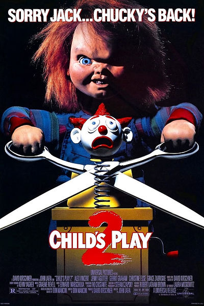
The doll is holding a pair of scissors, making them appear large. This emphasises the danger of them symbolising a weapon, connoting murder, violence and danger. In regard to horror, the genre is reinforced by the use of a weapon. The iconography presents the genre of the movie as it can only relate to horror.
'Sorry Jack... Chucky's Back!" The tag line is short and snappy, allowing the audience to clearly realise it is a sequel. The rhyme makes it memorable, capturing the audience. It also reinforces the narrative of the movie, in this it is highlighted that out of both children's toys, Chucky is the most powerful and villainous toy.
The doll is linked to the idea of children, portraying innocence to add to the horror of something unexpected to be used as the antagonist in a film. The red hair infers anger, danger and blood which is stereotypical for a horror film. Half the doll's face is covered in darkness to create mystery, also implying that there are two sides to the child-like item, good and childlike and evil and demonic. The doll is portrayed in a particularly menacing way, contrasting the idea of them being seen as cute, cuddly and fun. Just by looking at this doll it is clear that it is not friendly, with its facial expression portraying anger, evil and frustration, which could reinforce the idea that he is a villain, portraying the genre. Due to the portrayal of the initial perception of dolls being harmless, some of the narrative of the film is conveyed, reinforcing the idea that the characters may be tricked by the doll, as they do not perceive them as being harmful or animate. However, when Chucky reveals his true self, their initial fearlessness will change into fright as they will be under threat.
The background is consumed in black, connoting horror, danger and mystery.
Following the idea of the colour scheme, the use of the colours black, red and white clearly portrays the horror genre. The colouring follows the stereotypical horror poster colour scheme. The colour red has connotations of blood, death and danger. The colour black infers the idea of evil, impurity and death. The colour white has connotations of innocence, perhaps representing the protagonists being under threat from the antagonist.
The jack in the box is also a toy linked to the theme of children. This portrays innocence and vulnerability so the horror is more surprising and threatening. The clown in the jack in the box is relevant. The use of clowns is typical in a horror film as they are stereotypical scary, the fact that the clown is scared in this poster emphasises the threat of the antagonist and the scariness of the film.
The typography gives the viewer a sense of the genre. In the film title the number 2 is written in a font and colour to appear as if it is written in blood. The number has ripped edges, conveying the idea of ripped, damaged skin, implying that the characters may have been attacked by the antagonist. In addition, the red colouring gives the title a fixed meaning that this is in fact a horror genre movie. The number two refers to other horror movies creating expectations amongst the audience and drawing the audience from an existing film to the new one, also conveying the idea that it is a sequel. The white lettering is smaller than the number 2, this may reinforced the idea that the power the villain has over the innocent characters is immense. The lettering is in a square, clear, bold font, making the title and tag line clear and bold, helped by the use of the colour white.