Original Photos
- Natasha
 |  |  |
|---|---|---|
 |  |  |
 |  |  |
 |  |  |
 |  |  |
 |  |  |
 |  |  |
 |  |  |
 |  |  |
 |  |  |
 |  |  |
 |  |  |
 |  |  |
 |  |  |
 |  |  |
 |  |  |
 |  |  |
 |  |  |
 |  |  |
 |  |  |
 |  |  |
 |  |  |
 |  |  |
 |  |  |
 |  |  |
 |  |  |
 |  |  |
 |  |  |
 |  |
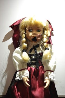
Shown below are the photographs which I decided were the best for use in my poster, above are all of the photographs I took for this shoot. The best photographs are effective for use due to many factors. Firstly, the prop is in many positions, increasing versatility making the likelihood of one of these images being easily applicable to the poster increase. The final image is a medium long shot, with the majority of the prop being shown in proportions I recognise from my poster research. The lighting may be adjusted using the brightness adjustment tool in Photoshop in order to create a more eery looking image, in addition to making the slightly weak lighting a stronger feature of the image. The doll is shown to be facing directly towards the camera, appearing to be staring into centre frame, directly at the viewer. This is a feature found when researching the posters. The colouring of the prop's clothing is a crimson red, white and black. This colour scheme relates directly to those shown in horror movie posters as it directly reflects the genre. The broken part of the doll's face makes the image appear more daunting, conveying the idea of damage. The use of the doll conveys a juxtaposition of tones and iconography, with the doll conveying innocence and purity but being portrayed in a sense connoting evil and danger. The subject is lit from above conveying a dark and eery image implying danger. The vibrance of the image must be reduced in order to portray a colour scheme more relative to the genre.

Camera Settings
The camera settings I used to take these photographs varied, however, the settings which I used to achieve the appropriate exposure in the final photograph had an aperture of F5 and a shutter speed of 1/6. While figuring out the settings many of the photographs appeared underexposed. The reason the doll was so difficult to photograph is because the lighting was very dim, with the lighting located directly above the prop and no other ay of illuminating it.
 |
|---|
 |
 |
 |
 |
 |
 |
 |
 |
 |
 |
 |
